
Today’s Wonder of the Day was inspired by Ginette. Ginette Wonders, “What is a percent bar graph?” Thanks for WONDERing with us, Ginette!
Imagine you’re conducting a survey. You’re asking people to name their favorite food. Or maybe their favorite color. Maybe you’re WONDERing about the prevalence of certain hair or eye colors. The question is up to you!
After talking to plenty of people and gathering your results, though, you’ve run into a problem. What’s the best way to share what you learned with others? You could list all of the responses on paper, but that might take a long time to read.
That’s where the subject of today’s Wonder of the Day might come in handy. It’s a great way to display data in a visual way so people can understand it quickly. What are we talking about? Bar graphs, of course!
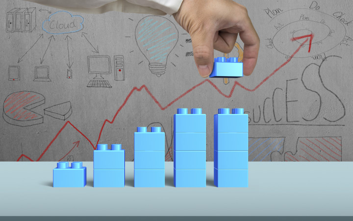
What are bar graphs? They’re charts that use rectangular bars to communicate information. Bar graphs are useful in making comparisons or measuring trends over time.
Have you ever looked at a bar graph? If so, you know they include several useful features. These can help you understand the information that’s presented. For example, most bar graphs have a title. This tells the person reading it what the graph is about—whether it’s favorite foods, colors, or something else.
Bar graphs are also always situated on two axes. These are lines that run horizontally (x-axis) and vertically (y-axis). In each graph, one axis will show what is being measured. It might list things like “people with hazel eyes” or “kids with brown hair.”
The other axis will be labeled with numbers. These numbers are always based on a scale that tells the reader how the results are measured. For example, one unit on the scale might mean one person. It could also mean ten people. It’s important to pay attention to the scale when reading a bar graph.
Of course, the most obvious feature of a bar graph is often the bars themselves. They may run horizontally or vertically. The bars will indicate the value of each measured category. You can read a bar graph by looking at the height or length of each bar.
Why do people use bar graphs? They’re a good way to present data in a visually appealing way. Bar graphs are a common choice in situations where people want to make comparisons and explain results. You’ll see them used in many lines of work, like finance, statistics, and sales.
Have you ever read a bar graph? Maybe you’ve even made one before! They’re a great way to share data. What information would you put in a bar graph?
Standards: CCSS.MATH.3.MD.B.3, CCRA.R.1, CCRA.R.2, CCRA.R.4, CCRA.R.10, CCRA.W.2, CCRA.W.4, CCRA.W.9, CCRA.L.1, CCRA.L.2, CCRA.L.3, CCRA.L.6, CCRA.SL.1, CCRA.SL.2

